
Color Temperature and CRI: The Science Behind Comfortable Lighting
Color Temperature and CRI: The Science Behind Comfortable Lighting
Have you ever purchased a light bulb that looked perfect in the store but felt all wrong in your home? The light might have been too harsh, too yellow, or made colors in your room look dull and lifeless. The culprit often lies in two key, yet misunderstood, specifications: Color Temperature and CRI (Color Rendering Index).
Moving beyond wattage (which now indicates energy use, not brightness), understanding these scientific metrics is the secret to creating lighting that is not only functional but truly comfortable, flattering, and aligned with your space’s purpose. Let’s demystify the science behind comfortable light.
Part 1: Color Temperature – Setting the Mood
What is Color Temperature?
Measured in Kelvins (K), Color Temperature describes the visual warmth or coolness of a light source. It’s based on the theoretical color of light emitted by a blackbody radiator at a given temperature. Contrary to intuition, lower Kelvin numbers mean warmer (yellower/redder) light, while higher Kelvin numbers mean cooler (bluer) light.
The Kelvin Scale in Practice:
Warm White (2000K – 3000K): Mimics the cozy glow of candlelight or sunset. This range is ideal for creating relaxed, intimate, and welcoming atmospheres. Think living rooms, bedrooms, dining areas, and hotel suites. A 2700K bulb is a classic choice for residential warmth.
Neutral / Cool White (3500K – 4500K): Offers a clean, crisp, and alerting light. It’s often described as “natural” or “daylight” white. This is perfect for kitchens, home offices, bathrooms (for tasks like grooming), and retail spaces where visual clarity is key. 4000K is a popular choice for task lighting.
Daylight (5000K – 6500K+): Simulates bright midday sun. This very cool, blue-tinted light promotes maximum alertness and concentration. It’s best used in garages, workshops, hospitals, commercial settings, and display lighting where detail-oriented work occurs. It can feel stark and clinical in living spaces.
The Science of Comfort: Our bodies have an innate circadian rhythm. Warm light (low K) in the evening signals to our brain that it’s time to wind down, while cooler light (high K) during the day can help boost focus and energy. Choosing the wrong color temperature for a room’s function can lead to visual discomfort, eye strain, or a mismatched ambiance.
Part 2: CRI – The Truth About Color
What is CRI (Color Rendering Index)?
If Color Temperature is about the feel of the light, CRI is about its quality and accuracy. CRI is a scale from 0 to 100 that measures a light source’s ability to reveal the true, vibrant colors of objects compared to how they appear under a natural reference light (like the sun or an incandescent bulb).
A CRI of 100 represents perfect color fidelity. Most high-quality LED bulbs for home use should have a CRI of 90 or above. Many standard, inexpensive LEDs have a CRI in the low 80s or even 70s.
Why High CRI Matters for Comfort:
Visual Accuracy & Appeal: Under a high-CRI light, a red apple looks richly red, greens appear lush, and skin tones look healthy and natural. Low-CRI light can “wash out” colors, making a vibrant painting look dull or food appear unappetizing. This visual distortion is subconsciously unsettling.
Reduced Eye Strain: When colors are rendered accurately, our eyes don’t have to work as hard to process visual information. This leads to less fatigue, especially in task-oriented environments like kitchens, studios, or reading nooks.
Elevates Design: For interior designers, artists, and anyone who cares about their décor, high-CRI lighting is non-negotiable. It ensures fabrics, finishes, and artwork are seen as intended, protecting your design investment.
Pro Tip: CRI (Ra) is an average of several color samples. For an even better metric, look for R9 (Saturated Red) value. A high R9 (above 50) is a strong indicator of superior overall color rendering, especially for warm tones, skin, and wood.
The Synergy: Combining Color Temperature & High CRI
The ultimate goal is to pair the right Color Temperature with a high CRI. This combination ensures your space not only has the correct mood (warm/cozy vs. bright/alert) but that everything and everyone within it looks its absolute best.
A Warm Bathroom Trap: Imagine a bathroom with 2700K warm light (good for mood) but a CRI of 80. Applying makeup or shaving becomes a guessing game due to poor color accuracy.
The Perfect Home Office: A 4000K neutral light with a CRI of 95 creates an energizing yet accurate environment, perfect for long hours of focused work without eye strain or color distortion on your monitor.
Conclusion: Choosing with Confidence
Stop guessing with lighting. Use this scientific framework:
First, choose the Color Temperature (K) based on the room’s function and desired mood (Warm for relax, Cool for focus).
Then, insist on a high CRI (90+). Don’t settle for poor color quality.
By understanding the science of Color Temperature and CRI, you move from simply illuminating a room to intentionally crafting an environment of visual comfort, beauty, and well-being. It’s the difference between light that you see, and light that makes you feel.
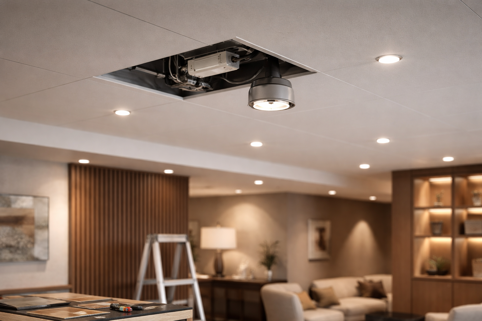 FM Lighting Replacements Without Guessing: Check Driver and Dimming Compatibility Before the Fixture Looks “Ready to Replace”
 Hotel & Serviced Apartment Refresh: Check Circuits & Dimming Before Choosing Fixtures
 Why multi-stakeholder projects rush timelines but delay decisions
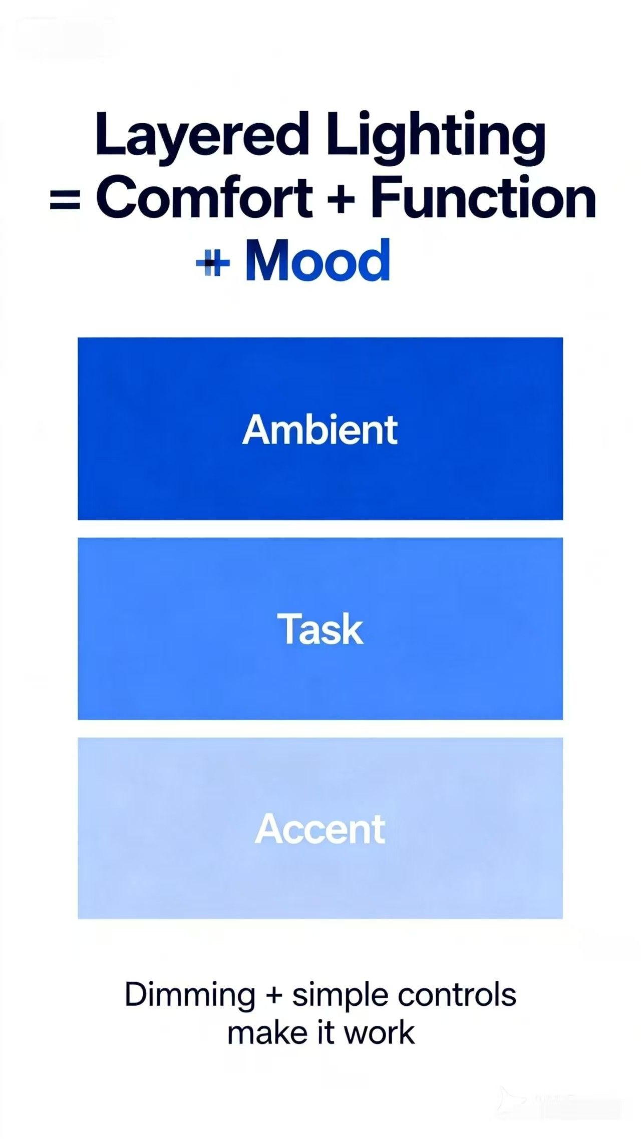 Layered Lighting 101: The Fastest Upgrade That Changes a Home